
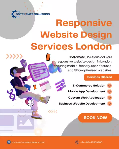
mobile usage surpassing desktop browsing, having a responsive website design is no longer optional – it’s a necessity. At Softomate Solutions, we are London experts in creating responsive websites that adapt seamlessly to all screen sizes.
Our design philosophy revolves around user experience, speed, and accessibility. We ensure that every website we build automatically adjusts its layout for mobiles, tablets, and desktops, without compromising on aesthetics or functionality.
Search engines like Google prioritise mobile-friendly websites. That’s why our responsive designs are also SEO-optimised, giving your business a competitive advantage in rankings.
Whether you’re running a corporate firm, a retail store, or a start-up, a responsive design boosts user engagement, reduces bounce rates, and increases conversions. With Softomate Solutions, you can be confident that your website is future-proof and ready for evolving customer expectations.
Choose us as your responsive website design experts in London, and give your business the digital edge it deserves.

- 110 观点
-
查看二维码

- Report Listing Cancel Report
-
- Current rating: 0
- Total votes: 0